Building Responsive Metric Displays
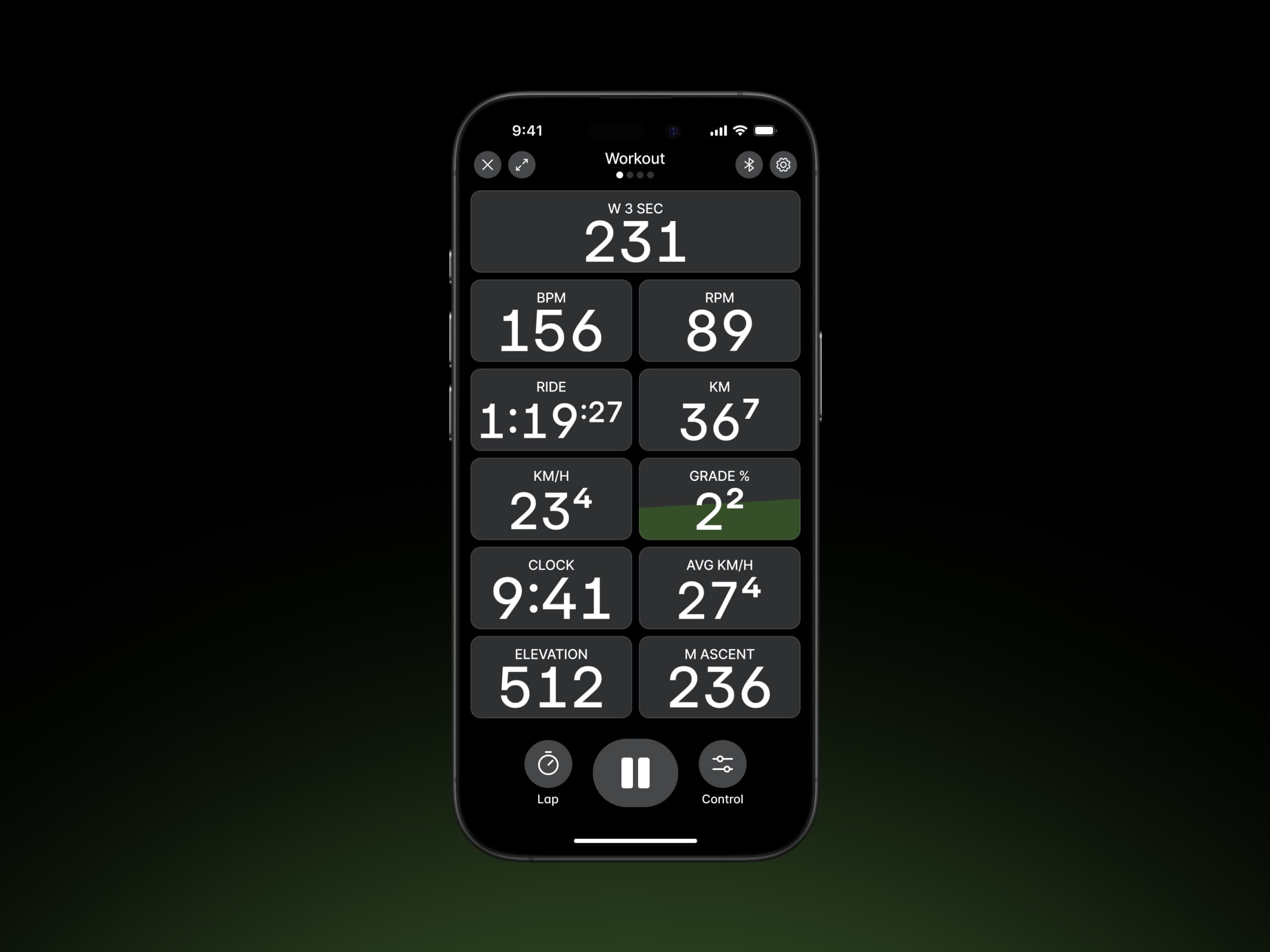
How I tackled an interesting challenge of building a scalable, responsive metric display for the Wahoo workout recorder—ensuring real-time metrics remain clear and legible across all screen sizes and layouts.
- Year
- 2022
- Role
- Design Lead
- Company
- Wahoo
Overview
Wahoo built the ELEMNT's interface for one screen size and one aspect ratio, and that constraint shaped how the company handled data. The feature that separated it from Garmin and the rest was Perfect Zoom. Press the side buttons mid-ride and the screen redraws with fewer, larger fields or more, smaller ones. The intent was to let you decide how much data you wanna see at any given moment mid ride: on a rough descent you can drop to two or three metrics and read them at a glance without taking your eyes off the trail for long.
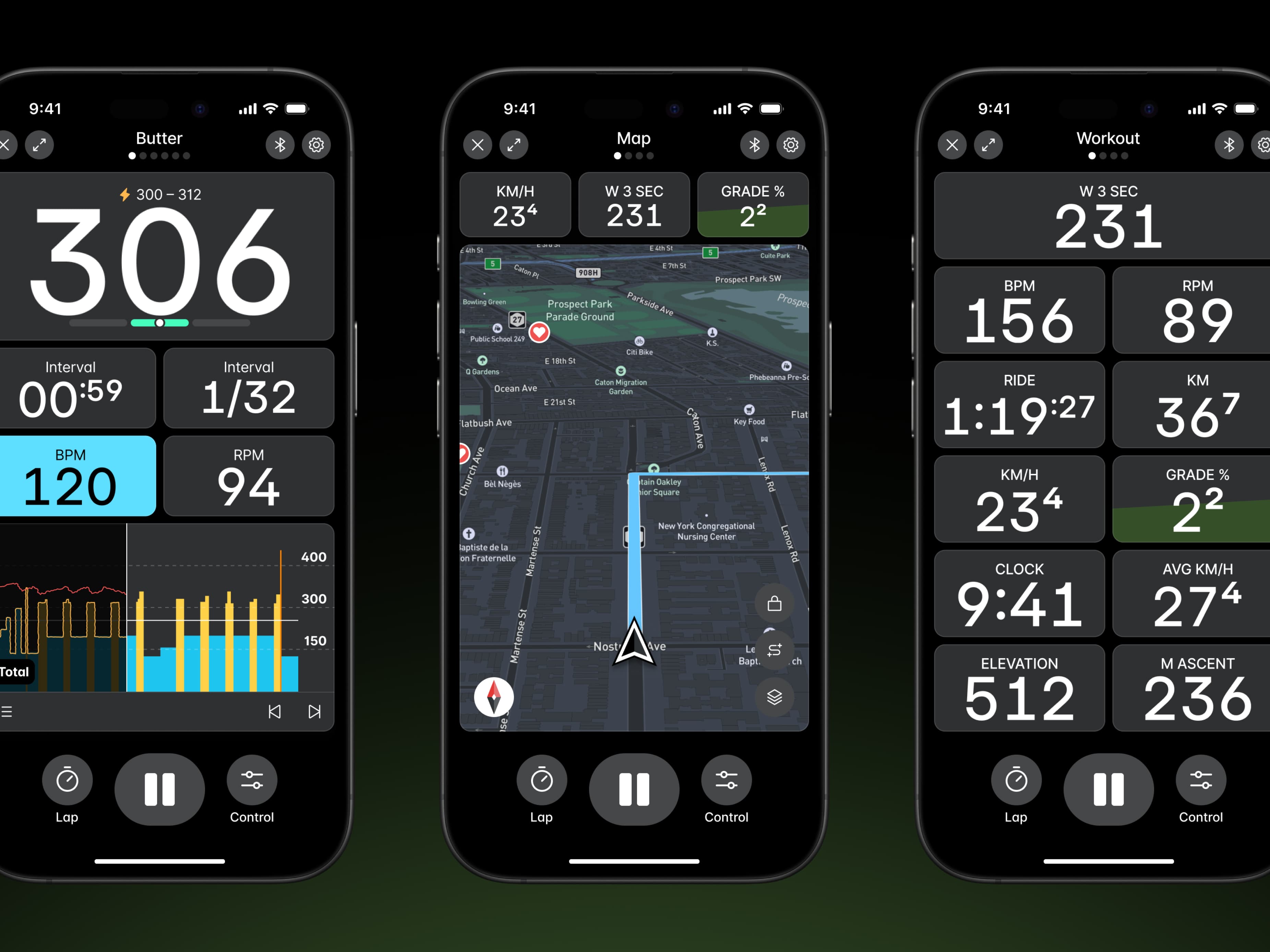
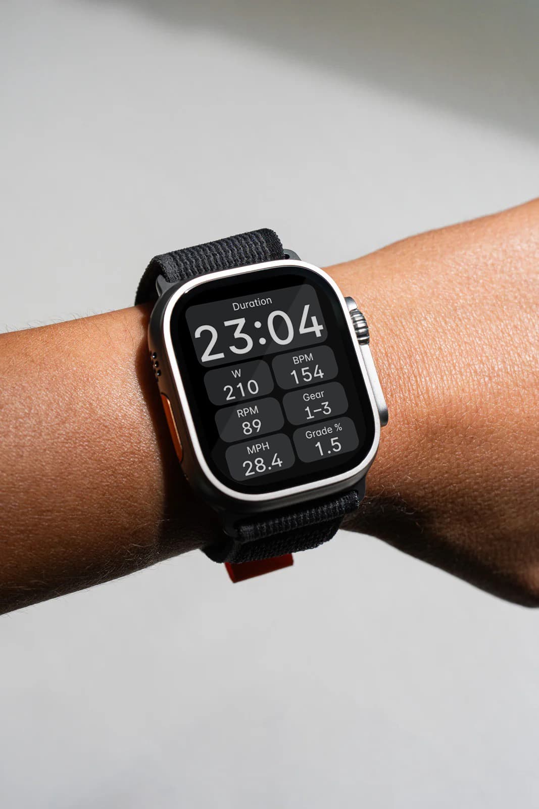
We wanted to bring the same level of usability into the Wahoo app workout recorder—extending the ELEMNT workout experience to phones, tablets, and even TVs. This introduced a new challenge though, creating a fully responsive workout view for the first time.
The Problem
Designing a responsive workout view brought an interesting challenge in optimizing font size for real-time metrics. Unlike our bike computers, which have fixed aspect ratios and resolutions, these views had to adapt to various screen sizes and orientations.
The design needed to support multiple metric types while ensuring readability. Users could zoom in and out, dynamically adjusting the number of visible metric cards. It needed a robust font size strategy to handle unpredictable data and layout shifts. The non-negotiable requirements were:
- Legibility: Metrics must always be glanceable.
- Efficient Use of Space: Metrics should fill the allocated area without overflowing or leaving empty gaps.
Why Container Queries Didn’t Work
My initial approach was to use container queries to determine the optimal font size. However, this method proved complex and required extensive calculations. It ultimately fell short because:
- Varying Metric Lengths: A heart rate value might be "120" (3 digits), while time could range from "0:02" (4 digits) to "1:02:12" (7 digits). Predicting an appropriate font scale in advance was difficult.
- Unpredictable Layout Changes: Metric card dimensions changed dynamically based on zoom level and screen size. A font size that worked in one layout wouldn’t necessarily work in another.
- Wasted Space & Overflow Issues: Some metrics left empty space, while others overflowed their containers. This made it difficult to establish a reliable font-sizing strategy.
Check out the interactive example below. Adjust the text and layout using the font size slider and columns dropdown to find the best fit within the card. When the text is properly sized, the setup will indicate “acceptable.” The six different metric types highlight the challenge of varying digit lengths.
Finding a font size that adapts to varying digit counts and layout adjustments wasn’t straightforward. This complexity led me to rethink the problem and explore alternative solutions.
Rethinking the Approach
Instead of manually adjusting font sizes based on digit count and layout changes, I treated the metric card like a scalable viewport, similar to how videos adjust to different screens without distortion.
Just like how object-fit: contain ensures an image fits its frame without cropping, this approach allowed the text to scale proportionally within its allocated space—no manual font sizing needed. This meant:
- No more manual font calculations—everything scales proportionally.
- Metrics always fit the space without distortion.
- Consistent readability across devices and orientations.
The Solution: SVG & ForeignObject
To solve the scaling challenge, I turned to SVG as the mechanism for rendering text graphics. Unlike traditional CSS-based scaling techniques, SVG provides a resolution-independent way to display content, making it ideal for this use case.
However, instead of using the standard <text> element—which is limited in terms of formatting and layout control—I leveraged the <foreignObject> tag.
By utilizing <foreignObject/> within an SVG container, I was able to embed HTML content (or React components) directly into the SVG. This allowed me to render text while ensuring it scaled proportionally to fit its allocated space.
<svg viewBox="0 0 100 20">
  <foreignObject width="100%" height="100%">
    // This can be any HTML element
    <span>120</span>
  </foreignObject>
</svg>Implementation
For a real-world implementation, I used this technique inside a React component. It dynamically measures the text dimensions and updates the SVG container accordingly. This ensures the text scales proportionally within the card, adapting to varying digit counts. View Codesandbox.
Key Learnings
This project was a valuable learning exprience for me. Through experimentation and iteration, I discovered a novel approach to handling dynamic text scaling within a fixed container.
- By leveraging SVG and
<foreignObject/>, I was able to create a flexible system that adapts to varying digit counts and layout adjustments. - SVG +
<foreignObject/>provides a powerful way to handle dynamic text scaling, ensuring metrics remain glanceable without complex CSS logic. - This approach opens up possibilities beyond just text—allowing for embedding of other visual elements (icons, progress indicators, etc.) in a responsive way.
Building Responsive Metric Displays
How I tackled an interesting challenge of building a scalable, responsive metric display for the Wahoo workout recorder—ensuring real-time metrics remain clear and legible across all screen sizes and layouts.
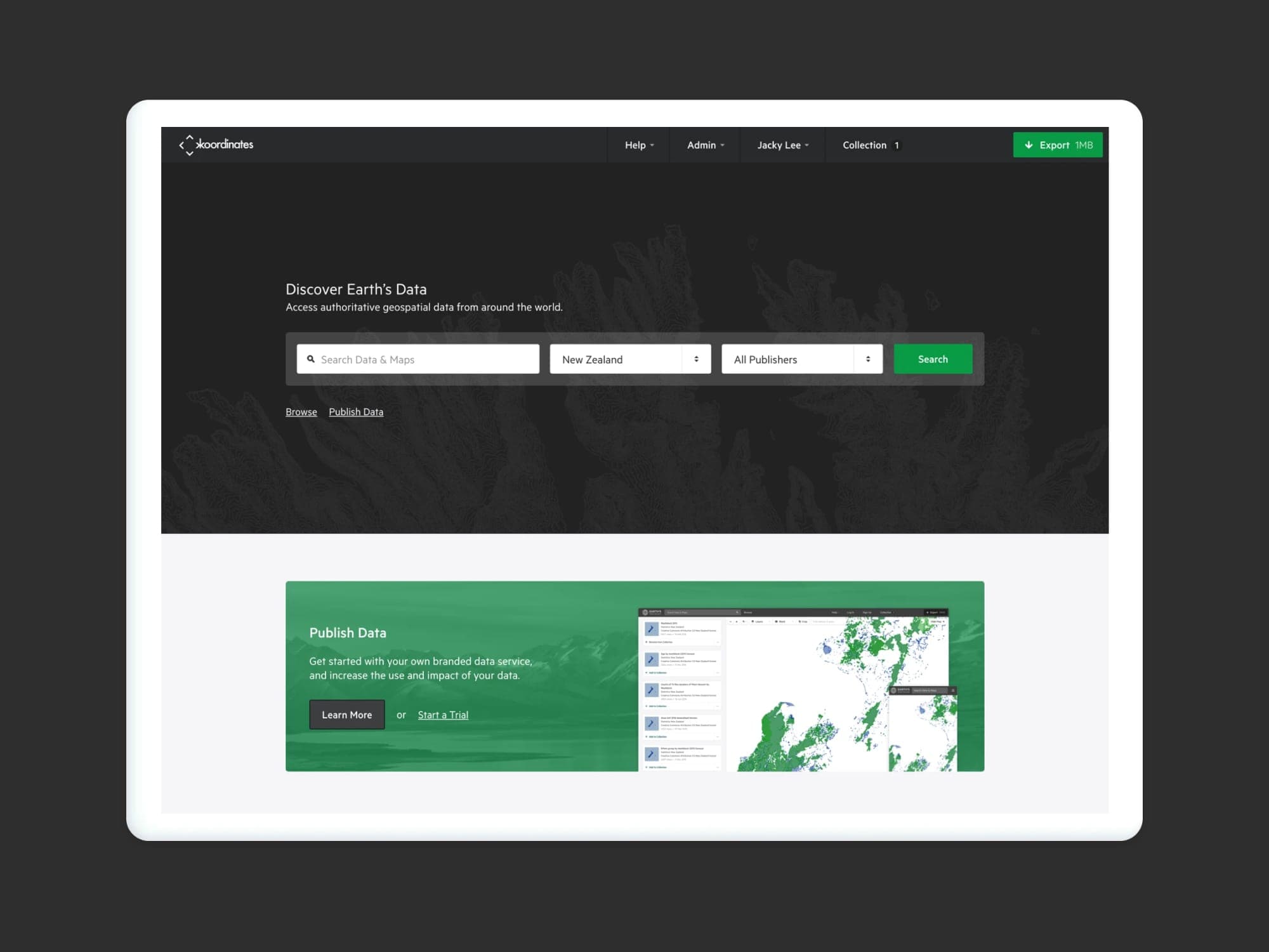
Koordinates — Discover Earth's Data.
Koordinates is designed and engineered for all data users—and not just those with technical expertise. With your own data service, you can realize the true potential of your geospatial data
Building & Evolving Wahoo Fitness's Design System
I led Wahoo Fitness in building a scalable, token-driven design system that integrates seamlessly with our existing Material UI React framework. By synchronizing design tokens, Figma components, and developer workflows, we streamlined our process, ensured consistent look & feel, and made it simple to adapt to new designs or feature expansions.