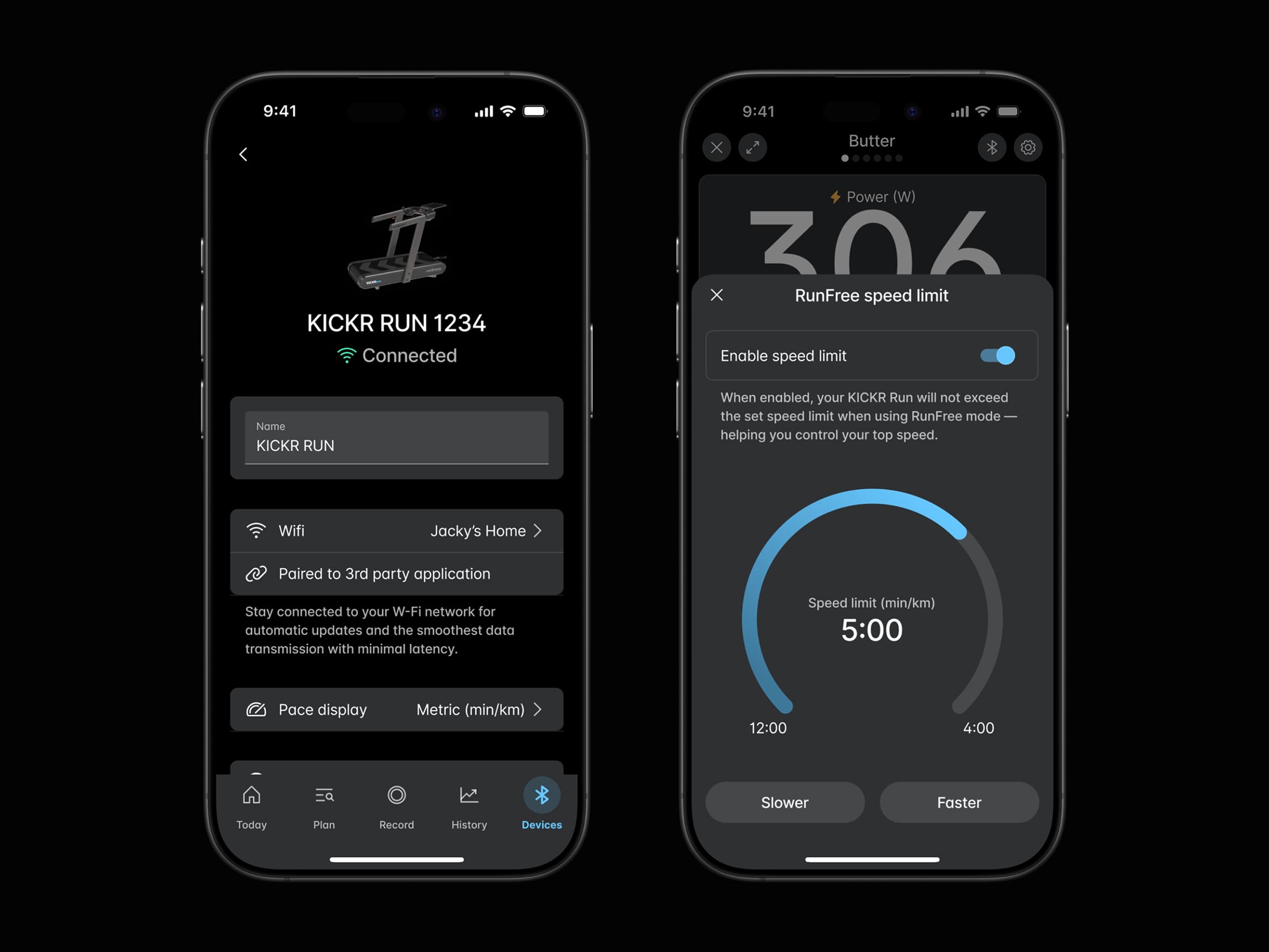
Building & Evolving Wahoo Fitness's Design System
I led Wahoo Fitness in building a scalable, token-driven design system that integrates seamlessly with our existing Material UI React framework. By synchronizing design tokens, Figma components, and developer workflows, we streamlined our process, ensured consistent look & feel, and made it simple to adapt to new designs or feature expansions.
- Year
- 2022-present
- Role
- Design & Development
- Company
- Wahoo
Overview
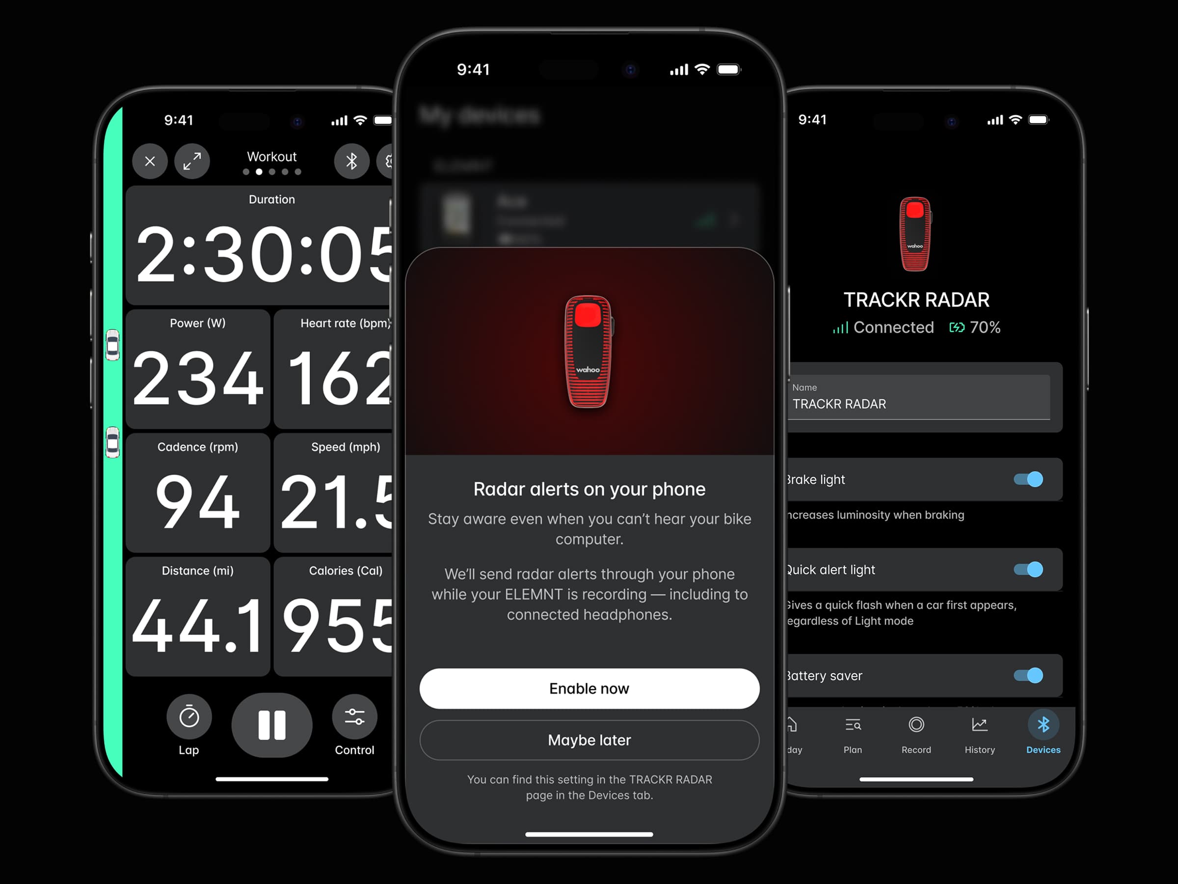
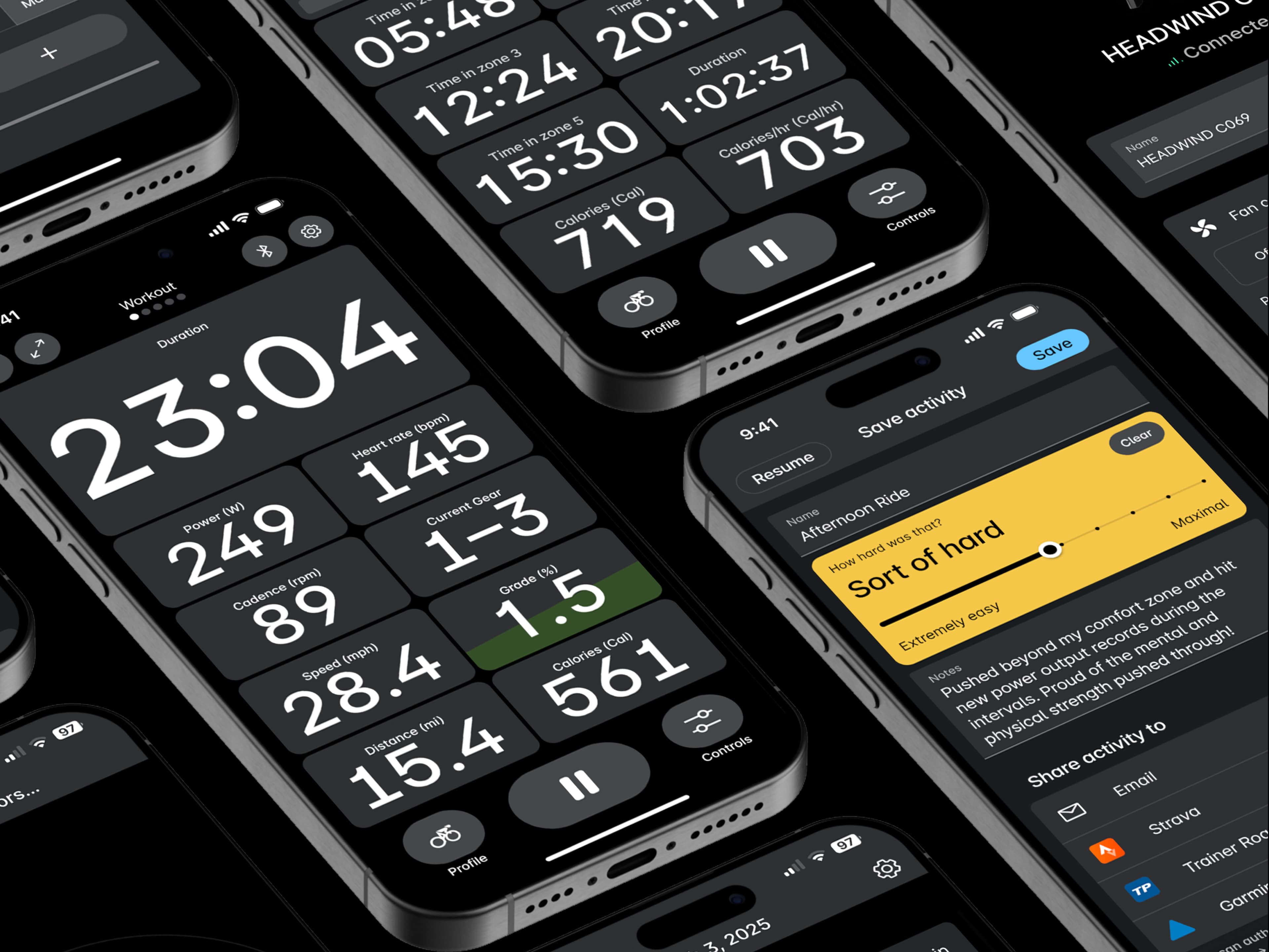
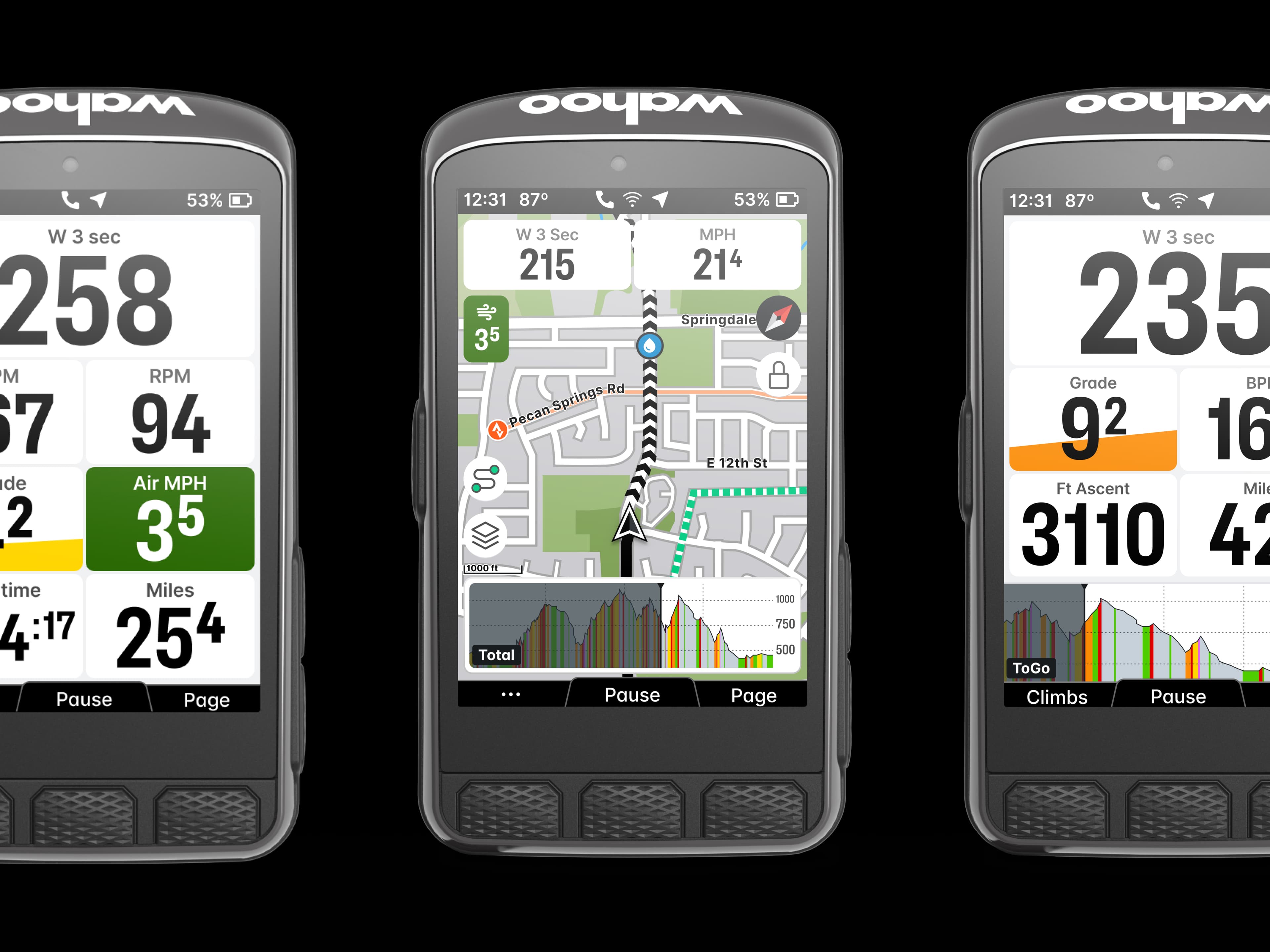
In 2022, Wahoo rebuilt the app from scratch. The product team was in flux at the time, so leadership brought in an outside agency for the first design concepts. The concepts weren't done, but our devs wanted to start building. I used that gap to build a design system that could hold the Wahoo ecosystem together across platforms, teams, and codebases without locking us into a look nobody had approved yet.
The Challenge
The designs came from outside. An agency owned the visual direction. Our in-house devs were laying the technical foundation before anyone signed off on it. So design trailed code, and neither side could afford to wait on the other. Since the timelines didn't line up, I built for whatever the agency might hand us. Color, type, and spacing had to be swappable. A change in direction should cost a few token updates, not a refactor.
They wanted to stay on Material UI in React. They knew it and shipped fast with it. Rather than push a new framework on them, I wrapped MUI into the system and kept their workflow intact. I paired design tokens with Tokens Studio in Figma and Style Dictionary on the build side. When the agency shifted a color or a type scale, we edited tokens instead of rebuilding screens.
The whole problem came down to keeping outside design decisions from stalling in-house dev work. That pressure is what made the system token-driven. The build went like this.
Approach
- Research. Gathered existing styles, patterns, and colors across Wahoo products to identify inconsistencies and consolidation opportunities. Paired directly with developers to understand pain points, must-haves, and future goals.
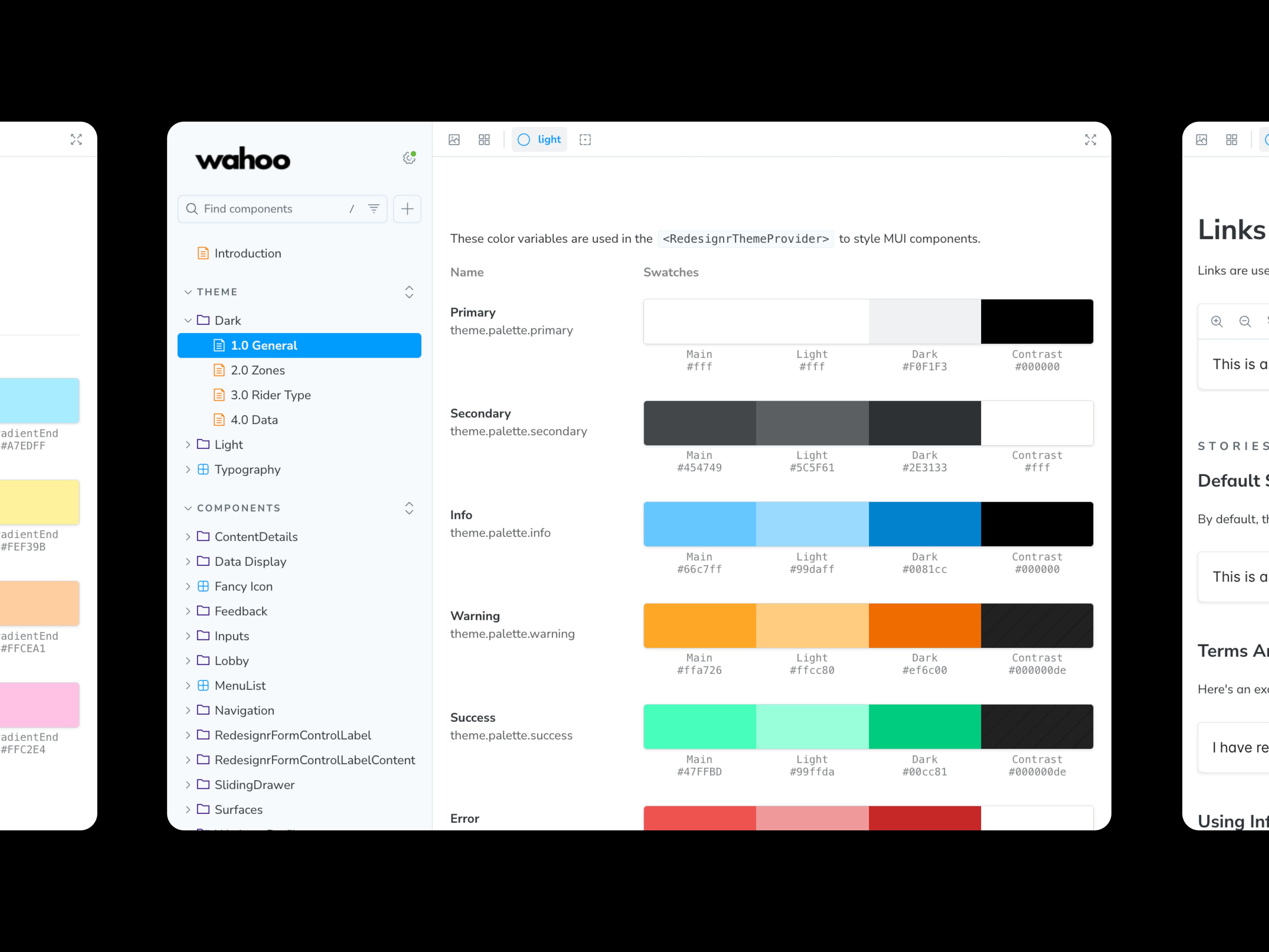
- Design tokens. Codified brand elements (color, typography, spacing) into platform-agnostic tokens. Then leveraged the Figma plugin to define and manage tokens directly in the design tool. Then built an automation build pipeline for exporting tokens into platform-specific files (e.g., JS, CSS, SWIFT (iOS), KT (Android)), reducing manual handoff errors and ensuring consistency.
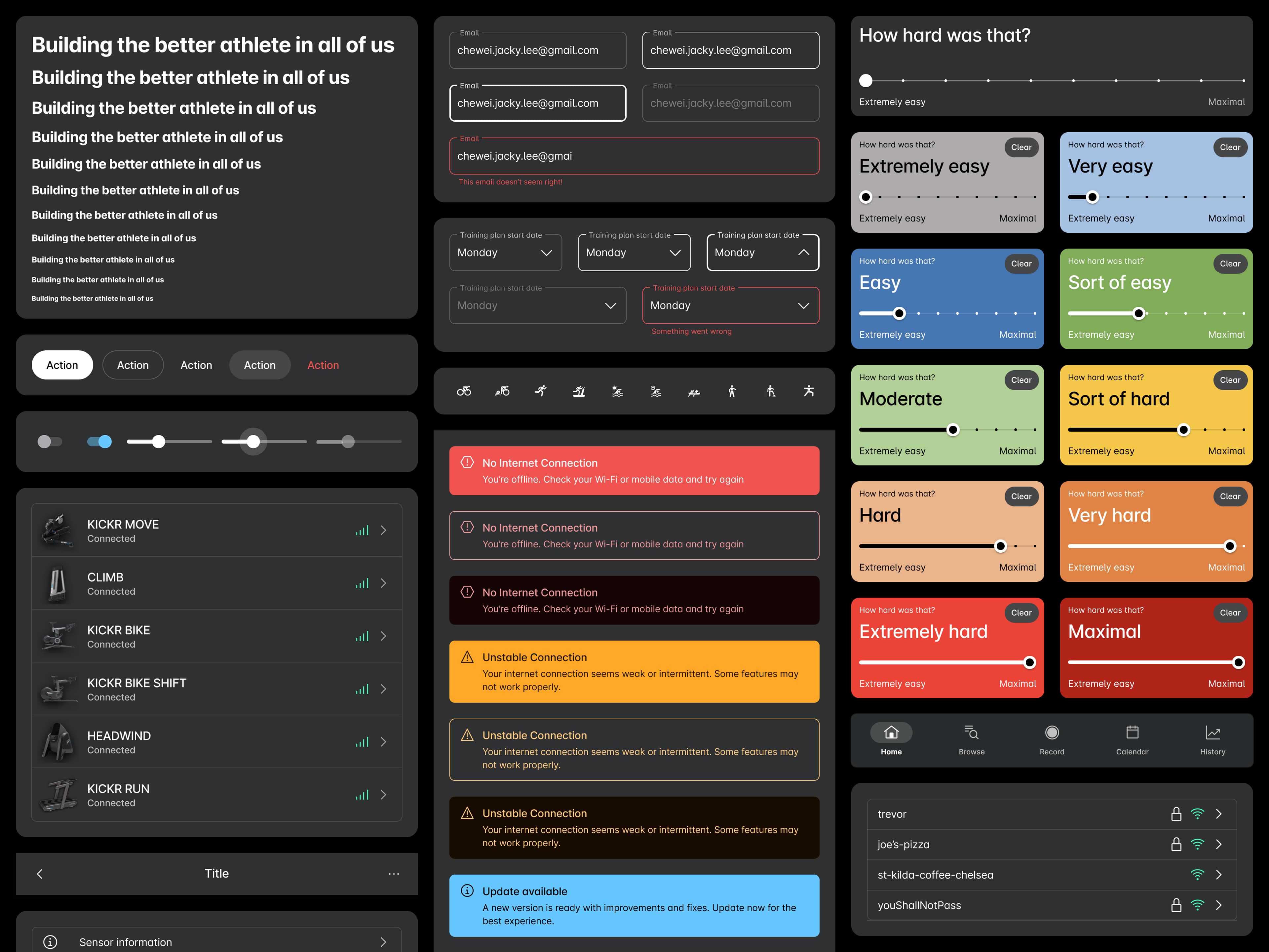
- Figma library. Maintained reusable components like buttons, modals, and navigation bars, aligned with MUI’s structure but styled with Wahoo’s unique look. This served as the design-side source of truth for visual references and high-fidelity mocks.
Storybook: Introduced a dedicated Storybook environment where designers and developers could collaborate in real time on the code-side of the components. By viewing each component in isolation, teams could quickly refine design details, test prop variations, and ensure cross-platform consistency without hunting through the full app codebase.
Guidelines & Standards: We are now in the process of creating a design guideline in Storybooks to capture usage rules, accessibility standards, and design rationale. This living documentation will help onboard new team members, foster consistency, and serve as a single source of truth for key decisions.
The solution
By making tokens the single source of truth, we created a design system ready to adapt to any future updates. Our Figma library and Style Dictionary integration empowered teams to quickly roll out changes across platforms—keeping devs comfortable with MUI’s familiar React workflow while ensuring on-brand designs.
- Scalable Architecture: Easily handle new feature requests and product expansions without major overhauls.
- Efficient Updates: A single token tweak trickles through every component in development and Figma.
- Platform Flexibility: MUI remains under the hood, but the end result looks and feels distinctively Wahoo.
Impact & Learnings
- Unified Brand Experience: Despite early design misalignment, the final product suite feels cohesive and professional.
- Developer-Designer Alignment: A shared “token language” has streamlined collaboration, making reviews more efficient.
- Consistent UI Across Codebases: All Wahoo Fitness app codebases reference the same library for colors, typography, and components, ensuring design consistency across micro frontends.
Overall, integrating a token-driven design system with our existing MUI setup made Wahoo’s workflow far more adaptable to shifting designs and priorities.
Throughout this journey, I deepened my understanding of design system management, focusing on something that works for both designers and developers. My biggest takeaway was that a truly effective design system can’t exist in isolation, it has to address each team’s unique needs. I initially viewed design systems as polished Figma libraries, but I soon realized the real source of truth belongs in the codebase, because ultimately that's what our athletes experience.
By leveraging build tools like Tokens Studio and Style Dictionary, we automated the repetitive tasks of updating colors, typography, and spacing—allowing developers to concentrate on building features, not tracking down style inconsistencies.
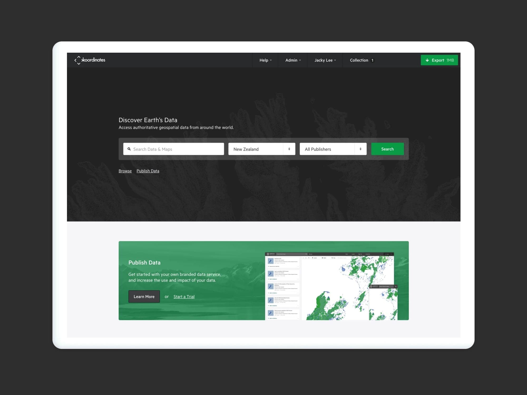
Koordinates — Discover Earth's Data.
Koordinates is designed and engineered for all data users—and not just those with technical expertise. With your own data service, you can realize the true potential of your geospatial data
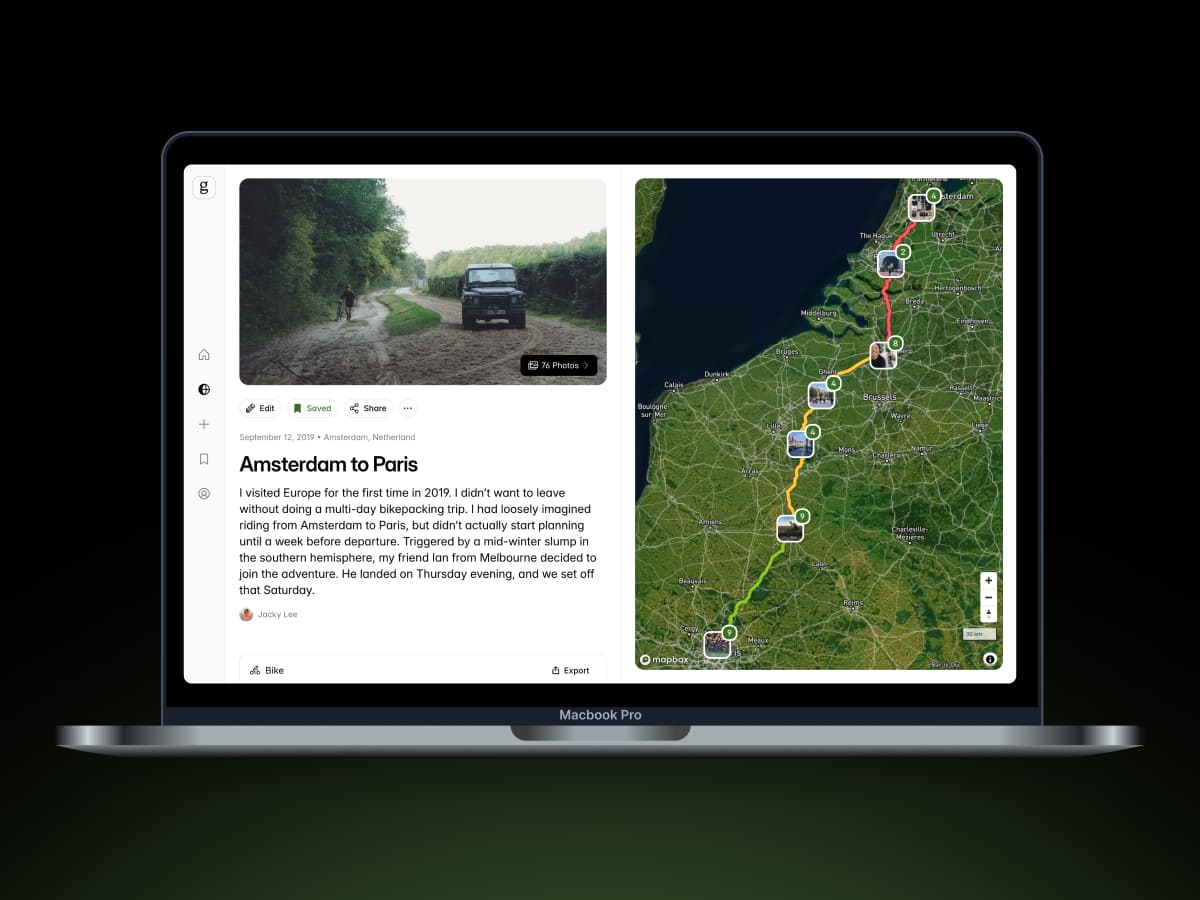
Gone — A Storytelling Platform for Outdoor Adventures
We set out to build a space where any bikepacker, trail runner, or hiker can combine vivid images, personal reflections, and real-time route data—turning outdoor adventures into interactive stories that inspires and fuel the next journey.
Wahoogotchi
An internal hackathon project that reimagines cycling motivation through play. Wahoogotchi blends endurance culture with the charm of digital pets to turn training into something more fun, personal, and a little weird in the best way.